
That simple swoosh isn’t just a design choice — it carries decades of racing heritage, innovation, and speed.
Car badges come in all shapes and sizes. Some are simple corporate signatures, like the familiar blue oval of Ford Motor Company, while others carry deep historical meaning, such as BMW’s famous roundel. Every emblem tells a story about the brand behind it — whether it represents a founder, a racing legacy, or a company’s vision for the future.
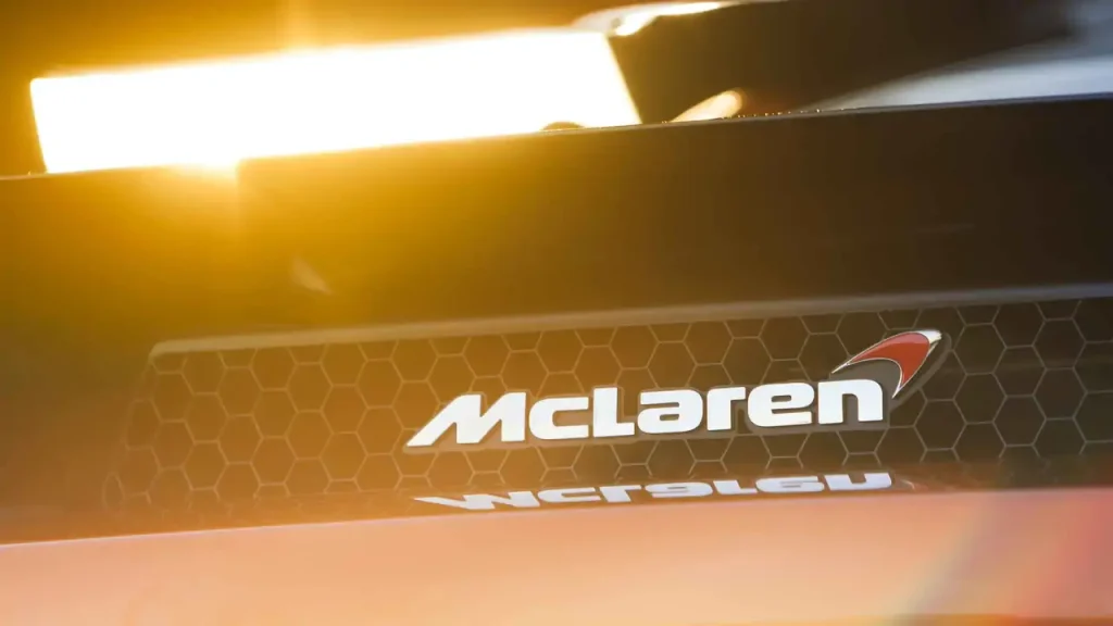
McLaren Automotive’s logo appears straightforward at first glance: the company name written in a sleek, modern typeface with a small curved mark extending from the final “n.” But that tiny swoosh has sparked plenty of debate over the years. There’s the official explanation from McLaren, and then there’s a theory that connects the symbol to the company’s earliest racing roots.
The swoosh’s origins can be traced back to McLaren’s long-running partnership with Marlboro during the team’s Formula 1 era. The cigarette company’s red chevron-style branding influenced McLaren’s own visual identity, with the team gradually incorporating a similar red mark into its logo. Over time, the design became cleaner and more minimal, eventually evolving into the small curved accent seen on McLaren’s modern branding.
When McLaren moved beyond motorsport and began creating road cars, including models like the McLaren F1, the logo continued to evolve. The sharp chevron was replaced by the smoother, more aerodynamic-looking swoosh that has become instantly recognizable around the world.
According to McLaren, that swoosh represents something deeply connected to the company’s engineering philosophy: the aerodynamic vortices created as air flows over a car. In a wind tunnel, smoke reveals these swirling patterns around a vehicle, and McLaren says the logo is inspired by those invisible forces that help its cars achieve greater performance.
However, some believe the story goes even further back — all the way to McLaren founder Bruce McLaren.
Before McLaren became a global supercar manufacturer, Bruce McLaren used a kiwi bird emblem on many of his race cars. The New Zealand native proudly displayed the symbol as a tribute to his homeland, and over time, that simple black kiwi silhouette evolved into a more stylized version known as the “speedy kiwi.”

Some enthusiasts argue that the modern McLaren swoosh is actually a refined interpretation of that early design. The similarities are difficult to ignore, and the transformation from a racing kiwi into a sleek aerodynamic mark makes for a compelling piece of automotive history.
McLaren, however, has never officially confirmed the kiwi connection and continues to stand by the aerodynamic vortex explanation. Whether the swoosh represents airflow, a racing bird, or perhaps a little bit of both, it remains one of the most recognizable symbols in the automotive world.
Whatever the truth may be, the logo reflects McLaren’s unique heritage — a company built on innovation, speed, and a relentless pursuit of performance. And who knows? Perhaps one day the legendary speedy kiwi could make a comeback.